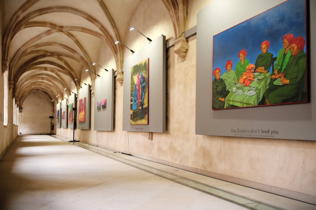
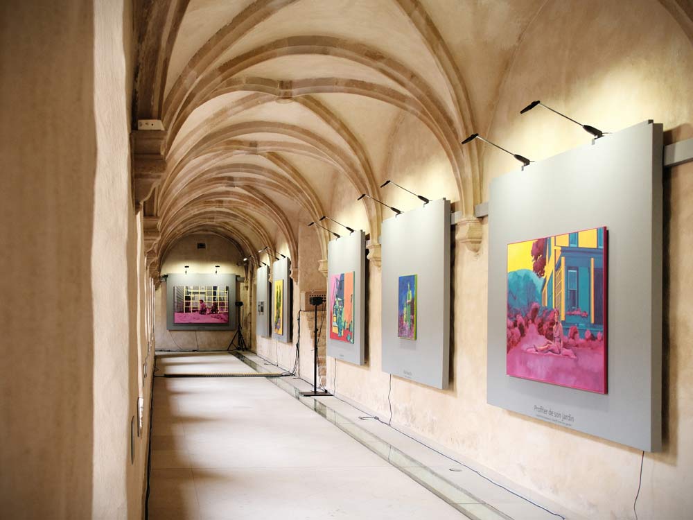
The exhibition was on display in the cloister of Neimënster during the Luxembourg Garden 2025. It featured 30 paintings and an interactive sound installation with music by Days of Delay (Cyrus Ashrafi), transforming the four aisles into an immersive experience.
CHANTAL MAQUET: COLOUR, SPACE, NARRATIVE
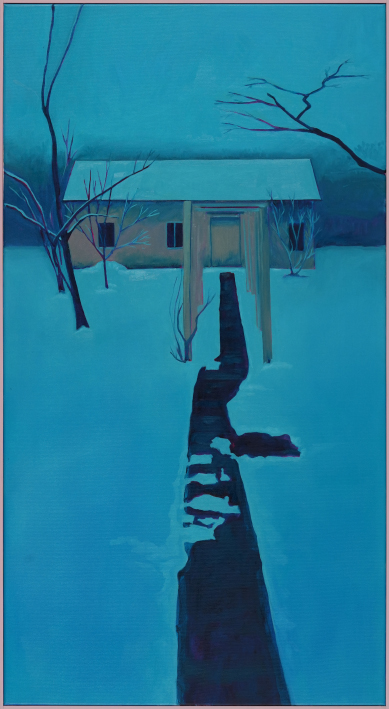
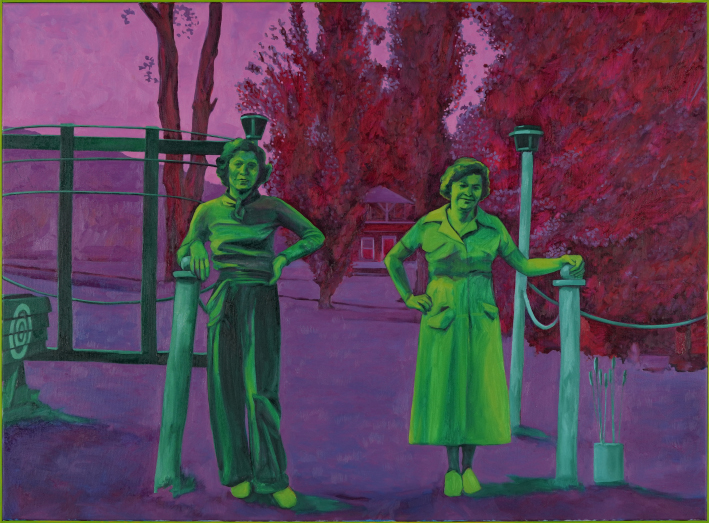
Echo saisonniers: you can hear the winter the moment you step into the cloister—the sound of rain tapping and harmonic tunes reminiscent of the cold season. A house bathed in cold hues from white and blue, with light pink and magenta highlights. Each aisle of the cloister is dedicated to the sensations of a season, evoking the cold of winter (backyard), the warmth of summer (Summerheat), the harvest in autumn (Kulturpflege), and sprouting of life in spring (Generativity). It is evident that Chantal Maquet does not seek a naturalistic rendering of her subject but rather an emotive one, which attracts the attention of passersby and makes them reconsider and reevaluate the seen. It might also be the setting itself and the addition of contemplative, yet evocative music by Days of Delay (Cyrus Ashrafi) that furthers the impulse to stop and contemplate the paintings, look at the faces, imagine the plethora of stories that are captured in each brushstroke, facial line, and absent gaze.
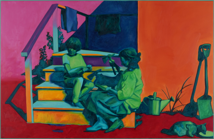
In essence, Chantal Maquet’s work portrays the attraction of colour. The way she places her colours and produces contrast is always with in intent of creating, and playing with, light. backyard is a poignant example for this practice, as the deep blue of the path brings out the lightness of the pale blue snow. The light pink of the frame further accentuates the rose-toned highlights where the evening sun hits the side of the trees and the house. But neither the lowlights nor the highlights are created with black or white, Chantal Maquet brings out the colour in her forms, almost in an impressionist manner. Indeed, the impressionist sought out the blues and purples, the greens and yellows, the reds and oranges in the shade on light, believing that nothing is ever truly devoid of colour (black) nor saturated equally by all colours (white). As such, one might be tempted to liken Chantal Maquet’s use of colour to the colourful applications observed in Impressionist painting.
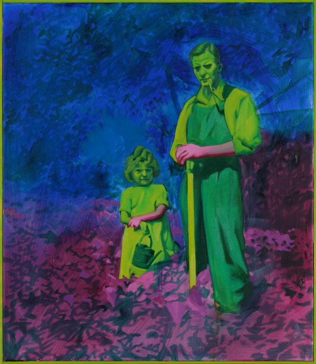
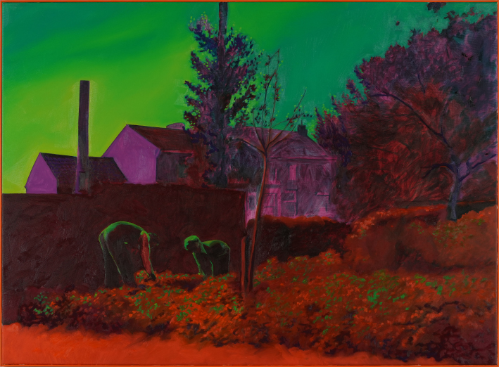
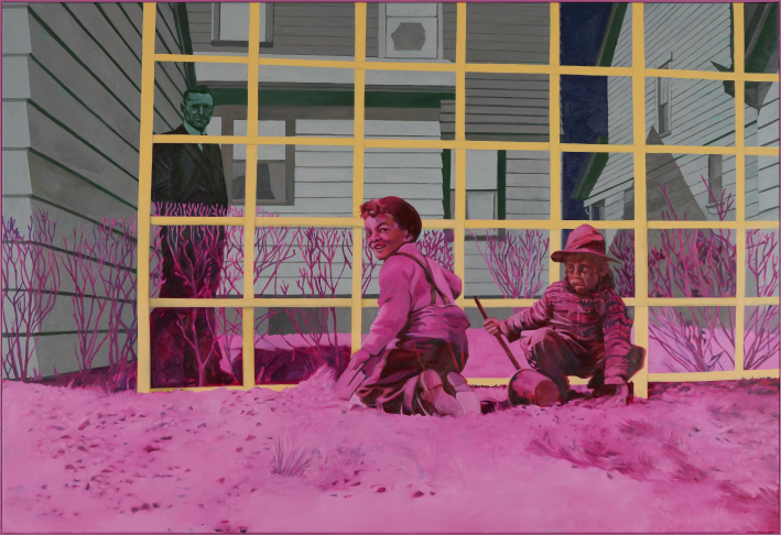
Yet, when looking at the application of the neon green and pink in Nachwuchs this comparison does no longer hold up. The man and the girl are depicted in a striking neon green, which is also taken up in the picture frame. The blue, purple, red, and magenta foliage that surrounds them constitutes a dark backdrop that makes them stand out even more. The focal point is the hands of the two gardeners, bright pink, like gloves, maybe reflecting the colouration of some of the plants, and yet they stand apart. Even though one could argue that it is a post-modern adaptation of Impressionist principals or neo-Fauvist application of unnaturalistic and bold colours, her treatment of the figure is neither stylised nor abstracted: her figures are well-modelled and individualised, though seemingly frozen in time. They have an individual identity. Compared to the decorative quality of René Matisse’s figures, for example, Chantal Maquet gives her characters agency. They directly look out of the picture frame. They seek the encounter. Similar to people cognisant of their photograph being taken, they want to be looked at. The colour application thus seeks a different purpose. The artist herself has claimed that her colour choice and placement are intuitive, not necessarily symbolic but it is the contrast that she is interested in. In Nachwuchs the contrast creates a narrative, it is the hands we should be looking at, the gardening, the coming together of different generations to work together in nature. The colour takes a structural and even narrational quality.
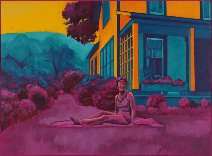
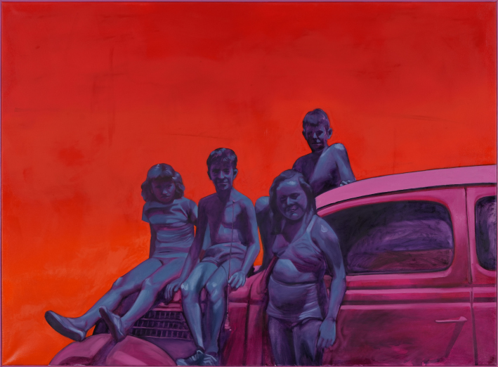
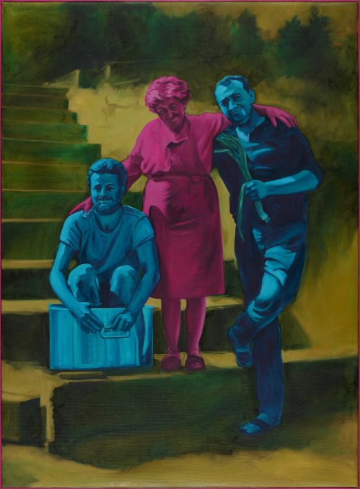
As surprising as it may seem, I would argue that Chantal Maquet’s colour treatment approaches her closer to medieval colour application than to modern or post-modern sensibility. The structural use of colour and the depiction of light is deeply ingrained in medieval and pre-modern imagery1. When looking at medieval illuminations with a continuous narrative, the main character of the story is depicted multiple times in the same image, characterised by the colour of their clothes. Each time the figure is portrayed at a different moment of the story: one image, multiple temporalities. This temporal character can also be observed in Chantal Maquet’s work, both as a storytelling device and as an anachronism. When looking at before the feast, both men are portrayed in blue, whereas the woman is bathed in vibrant magenta. This could imply that the figures exist on different temporal planes, suggesting an imagined family reunion, giving this joyful family portrait a nostalgic and almost mournful undertone, a longing for a moment that never was. This feeling might also be provoked by the earlier mentioned posed, slightly unnatural, photograph-like composition of her paintings. Indeed, Chantal Maquet bases her figures on old photographs, found in flea markets, estate sales, or even her own basement. As such, each work is an imagined bringing together of people, creating images of encounters that never happened, of people from different times, different countries, different temporalities. Her work is thus by definition anachronistic.
The combination of lived reality, imagination, and colour coding is inherent to medieval altar pieces and commissioned illuminations. The Melun Diptych by celebrated French painter and illuminator Jean Fouquet from around 1452 is a masterful example of this practice. The left panel depicts the busts of patron Étienne Chevalier and St Stephan, both wearing red and blue clothing, whereas the right panel celebrates the Virgin Mary and Christ, in the pose of the Virgin lactans, i.e., with one exposed breast, feeding baby Jesus. They are seated on the heavenly throne surrounded by the guardian angels. Their colour denotes the angels’ function: the blue cherubim are holding up the heavenly throne and represent the Presence of God’s spirit, whereas the red seraphim are guarding the throne and are often described as “fiery guardians”. The innate anachronism of this painting can not only be perceived in the fact that the donor is in the same painting as a biblical saint, but also in their clothing, and even in their likeness. As such, art historians have likened the Virgin to Agnès Sorel, mistress of King Charles VII2. The high hairline, which was common fashion among the French court, indicates Fouquet’s sensibility to flatter his contemporaries. Her clothing and skin tone as well might indicate her noble descent, but more than that, her lightness, especially compared to St Stephan and the donor, is striking. The colouration of the angels, as much as the figures of the Virgin, Christ, St Stephan, and Chevalier, is either true to scripture or seemingly naturalistic. When looking at the four main figures closer, one can recognise very distinct variations in skin tones, from Chevalier being the darkest to the Virgin and Child the lightest. Their skin seems to be radiating. Their lightness is not as much a naturalistic representation of the sitter as it is a physical manifestation of their purity and holiness: the more the figure radiates light, the higher it is within the symbolic hierarchy of the painting. This is also why Chevalier, though a nobleman and patron of this diptych, seems darker3. Indeed, the medievalist Caroline Walker Bynum explains that the representation of colour is “to represent not so much in the sense of ‘looking like’ as in the sense of ‘manifest[…] the significance of’”. 4
The monochromatic treatment of Chantal Maquet’s figures seems indeed closer to Jean Fouquet’s colour treatment than that of early modernist painters: the figures are not lacking in depth, or are reduced to simplified forms, they are perfectly modelled, just like Fouquet’s angels. This would imply her colour treatment, beyond a structural and temporal role, could also hold a certain symbolic value. In Generativity, the three women are portrayed in green holding a magenta lamb. They are sitting in an inverted triangular composition, placed on a staircase on a gold-toned background (the red underlayer gives the yellow a golden note). Though the figurative motive is lifted out of its formal context, the background frames it. The figures are held by the gold, rather than floating in empty space, comparable to Byzantine icon paintings. And just like icons, nothing diverts the gaze: the colour accentuates the composition, as the peak of the inverted green triangle leads us straight to the magenta lamb. The three figures are secondary to this symbol of youth, purity, and spring. It might be surprising that the lamb is not green, a colour that is usually associated with nature and even spring. In Scivias, Hildegard of Bingen even described green as more than just a colour: it was a life force. But through the magenta of the lamb and the green of the women an interesting thought arises: the women are the life force, and they are protecting the young lamb, the offspring.
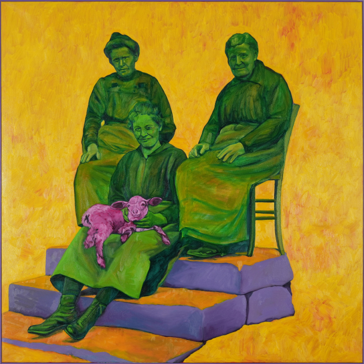
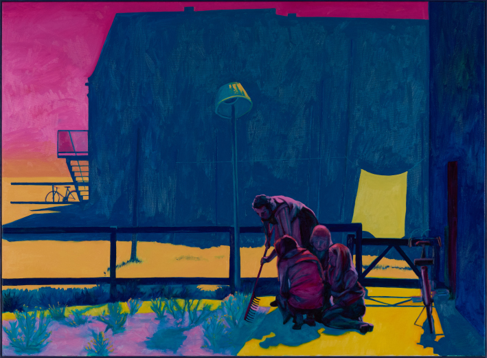
When looking at the overall composition of the exhibition in neimënster’s cloister, Echos saisonniers, Generativity depict spring. The theme of the four seasons is deeply steeped into medieval visual culture from murals, stained glass windows, to illuminated manuscripts. Green was the colour associated with spring, but as Michel Pastoureau explains, ‘for the other seasons, there was less consensus. Summer was often symbolized by red, sometimes by gold or orange; autumn by yellow or black (the color of Saturn and of melancholy), more rarely brown; winter by white or black’.5 As such, ‘the palette of the seasons was relatively unstable. Spring alone possessed only one lively and seductive color: green’.6 Furthermore, though most of the seasons represented the work of the farmers and the field work, spring was reserved for the nobles.7 When looking at Chantal Maquet’s paintings, her work’s composition implies a certain nobility or leisurely activity, whereas in winter two boys are playing/working in the mud, in summer people are guarding/gardening, and in autumn people are working the field and preparing meals. Even though I would argue that Generativity is the work that holds the most resemblance to medieval visual sensibilities, as the composition leans both on Byzantine icons and Christian altar pieces, elements of the colour treatment can be found in each one of her works.
As such, it is not just the setting in neimënster’s cloister, the ancient walls, barrel vaulted ceiling, and semicircular arched windows, that gives the exhibition an anachronistic feel, but the paintings themselves – they seem to belong to multiple temporalities at once. Who would have thought that Chantal Maquet has that much in common with medieval painters?
Dr Lisi Linster
1 John Gage, Colour in Art (London: Thames & Hudson Ltd, 2006), 19.
2 See Stephan Kemperdick (ed.), Jean Fouquet : The Melun Diptych (Berlin: Gemäldegalerie, Staatliche Museen zu Berlin, 2018).
3 It should be noted that this is less of a racial commentary than the idea of capturing light.
4 Caroline Walker Bynum, Christian Materiality. An Essay on Eligion in Late Medieval Europe (New York: Zone Books, 2015), 59.
5 Michel Pastoureau, Green: The History of a Color (Princeton NJ: Princeton University Press, 2023), 21.
6 Ibid. 65.
7 Ibid. 66.